Hover card widget
About
The hover card looks similar to a card or enhanced card but allows up to two images to be uploaded. Instead of linking to additional content like other cards, the card is able to display additional content on the same page. Initially, the first card content displays. When the card is hovered over using a mouse, the image interactively changes to show the content of the second card.
Design
Hover card template

Hover card example

This is the hover card with a second image selected.
Flip card template

Flip card example

This is the flip card with a second image selected.
Zoom card template

Zoom card example

This is the hover card with a second image selected.
How to
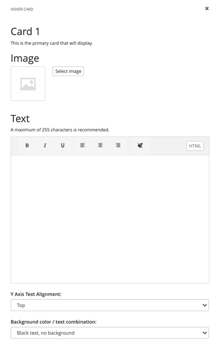
Drag the hover card widget from the right column onto your page. Click Edit.

For the default view (or card 1), select an image and enter the text you would like to display. You also have the ability to adjust the text alignment and color and with a background color.

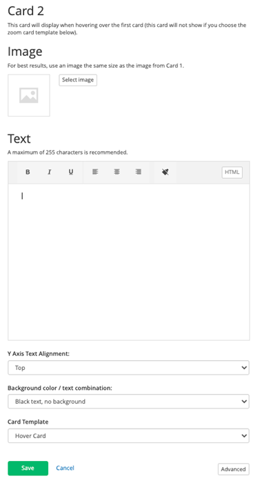
Next, select an image and enter the text you would like to display for the hover or the flip view (card 2). Again, you also have the ability to adjust the text alignment and color and with a background color. You also can choose which card behavior you like in the template field.
NOTE: If no image is chosen for the second card when using the hover or zoom templates, the image in the first card will automatically show for the second card. Also note, the zoom template will only use the first card image selected.

Additional Information
Tips
• Use card widgets to highlight specific content, not for all the content on your page.
• Do not include too much text; it will run outside of the image box.
• If you choose 2 different images for card 1 and card 2, they should be the same size to avoid any visual issues with the display.
• Limit the number of card widgets on a page to avoid clutter.