Hero carousel widget
About
Want to add multiple large, powerful images to the top of your page? The hero carousel widget is perfect for grabbing your audience's attention and showcasing multiple topics. Use this widget to express your organizational brand with strong visuals
that represent your site, featured content, upcoming events and much more!
Design
There are two modes of display for this widget. The examples below show a variation of simple view and advanced mode.
Simple View
Example Slide 1
This is example content for the subhead of this slide example.
Example Slide 2
This is example content for the subhead of this slide example with no button
Example Slide 3
Advanced View
Example Slide 1
This is example content for the subhead of this slide example.
Example Slide 2
This is example content for the subhead of this slide example with no button
Example Slide 3
How to
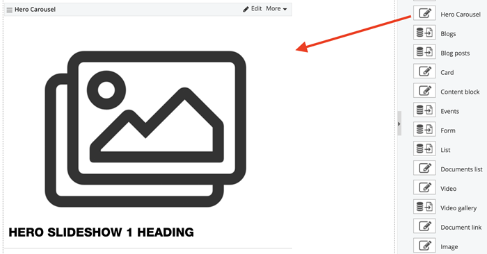
Drag the hero carousel widget from the right column onto the page and select Edit. NOTE: This widget should be used just below the top navigation, at full-width, spanning across the entire width of the page.
Choose the pixel height of the slideshow for desktop and mobile at the very top of the pop up window.

Simple View
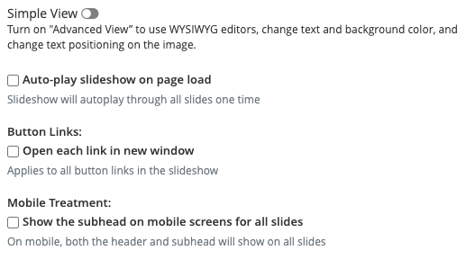
Use the default settings, known as "Simple View" below, to add a simple title and a subhead overlay to each slide. Then choose settings related to auto play, button links and mobile treatment.
Choose images. Then add headlines, subheads and/or buttons on top of your images by selecting the Edit option to the right of each image.
Add up to six images and slides by selecting "Add carousel item" at the bottom.
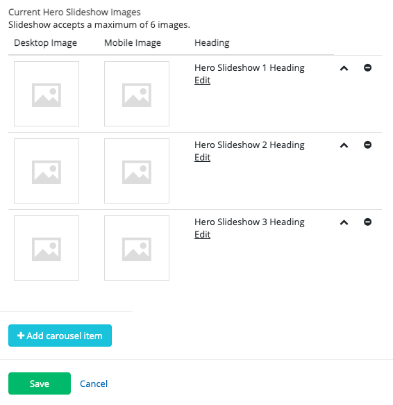
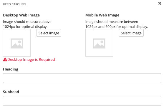
Select Edit for each slide to select images, and enter the heading and subhead text:
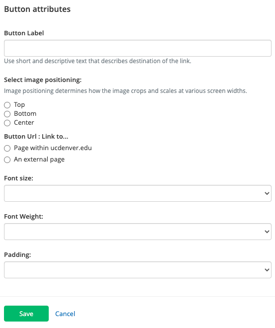
Fill in the button fields and Save:
Advanced View
If you need more flexibility around the text color and positioning, as well as background color, turn on the "Advanced View ". Then choose settings related to auto play, button links and mobile treatment.
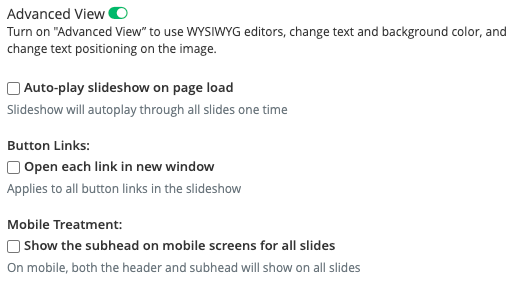
Choose images. Then add headlines, subheads and/or buttons on top of your images by selecting the Edit option to the right of each image.
Add up to six images and slides by selecting "Add carousel item" at the bottom.

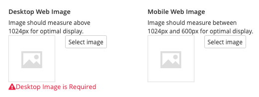
Select Edit for each slide and select images for desktop and mobile.
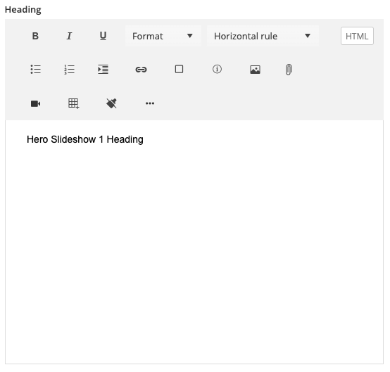
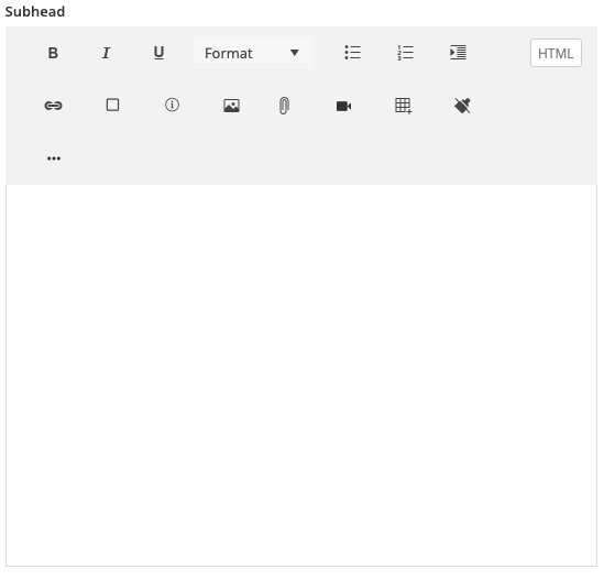
Use the WYSIWIG editors to customize title and subhead:
Fill in the button fields and Save:

Additional Information
Tips
Image size should be at least 1600 pixels wide. Always use landscape orientation.

Reorganize your slideshow by using the arrow (^) on the far right side of your slides.

Delete slides by selecting the minus (-) on the far right side.
