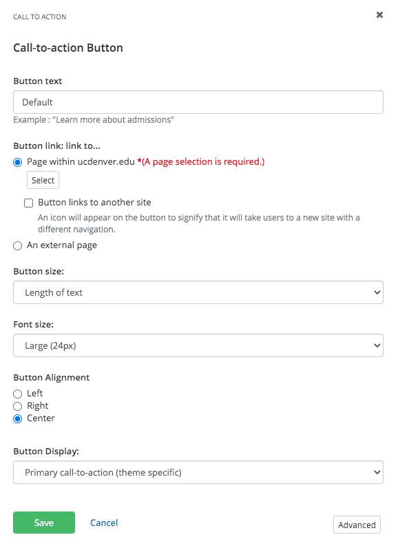
Call to action widget
About
Need a simple, clickable button? The call to action widget is perfect for encouraging users to take an online action, like "sign up for training," "register for event," "donate to a cause" or "learn more about admissions".
Design
Dual themed color options
Additional color options
Every theme in Sitefinity has three theme specific colors to choose from. They have been predetermined to fit well within your theme design. Furthermore, you can choose to use the additional color variations below in this widget to further customize your design. To choose your colors, select them under the button display dropdown menu when editing the widget.
| Color name | Color Example |
| White text, black background | Sample |
| White text, dark grey background | Sample |
| Gold text, black background | Sample |
| Black text, light grey background | Sample |
| Black text, grey background | Sample |
| Black text, light gold background | Sample |
| Black text, gold background | Sample |
| Black text, dark gold background | Sample |
How to
Drag the call to action widget from the right column onto the page.

Choose Edit to enter button text, select a page to link to and choose a color.

Additional Information
Accessibility Requirements
To make your button accessible for all site visitors, be descriptive and concise with button labels. For example, instead of using "Learn More" in regards to admission requirements, try using "Learn More About Admissions".
Link Destination Indicators
Two button icons are available in this widget so you can indicate link destinations:
![]() an external site
an external site
 a password protected page. (please note: this overrides external site if both options are checked)
Tips
• A call to action is often referred to as a "CTA."
• Use CTAs to direct users to key pages of your site that align with measurable initiatives of your department.